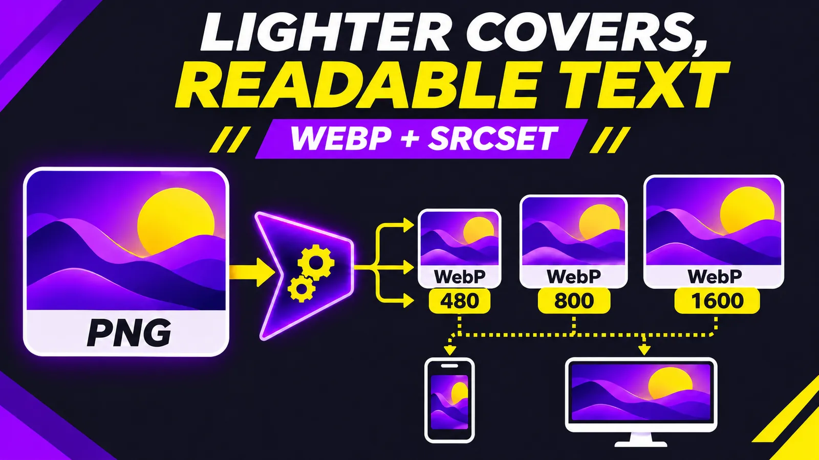
You made a cover for a blog post or landing page, and its PNG export is over 1 MB. It looks sharp on a desktop, but a phone downloads that large original for a much smaller display area. A useful experiment is to serve several WebP widths with srcset while checking that the headline remains readable.
I ran the commands on the English cover of this guide. Its source PNG is 1672 × 941 pixels and 1,620,590 bytes. At WebP quality 82, the 480 px output is 22,044 bytes. On the Spanish variant of the same design, the measured outputs were 22,240 bytes at 480 px, 40,740 at 800 px and 82,846 at 1600 px. These are observations on two illustrated covers, not universal compression ratios. At 480 px, the large headline remains readable; the diagram's tiny labels become harder to inspect. Solve that design problem before asking compression to fix it.
This is the actual 480 px output from the English cover, shown without increasing its resolution:
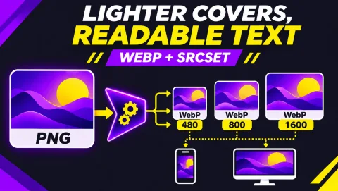
Compare the large title with the diagram labels before setting your own minimum image width.
Make the image candidates
Install the cwebp utility from the WebP project, then check cwebp -version. Its official reference describes -q as the quality versus size control and -resize width 0 as proportional resizing. Replace cover.png with your source. Inspect the outputs at the size where readers will actually see them, especially if the artwork includes thin type.
for w in 480 800 1600; do
  cwebp -quiet -q 82 -resize "$w" 0 cover.png \
    -o "cover-$w.webp"
done
ls -lh cover-*.webp
I executed this loop on the Spanish cover and confirmed all three file sizes and dimensions; the English 480 px candidate was also generated and inspected. A smaller file is useful only when the message survives. If a key word is unreadable at 480 px, simplify the artwork or create a mobile variant with larger type. Raising quality cannot restore a label that has too few pixels.
Give the browser honest choices
Upload each WebP and replace the sample paths below with public image URLs. srcset lists candidate widths; sizes describes the image's expected layout width. MDN explains that the browser also considers device pixel density, so a high-density phone may choose a larger candidate. It is inaccurate to promise that every mobile visit downloads the 480 px file.
<img
  src="/img/cover-800.webp"
  srcset="/img/cover-480.webp 480w,
          /img/cover-800.webp 800w,
          /img/cover-1600.webp 1600w"
  sizes="(max-width: 600px) 100vw, 800px"
  width="1600" height="901"
  alt="Illustrated guide to WebP and responsive cover sizes"
  loading="eager"
  fetchpriority="high"
/>
This assumes a full-width image up to a 600 px viewport and an 800 px maximum image on desktop. Change sizes to match your actual CSS. The dimensions reserve space while the image loads. Use loading="eager" and fetchpriority="high" when this is the visible hero likely to be Largest Contentful Paint. Google advises against lazy loading an LCP image. For images farther down the page, consider lazy loading instead.
Suppose the article column is 800 CSS pixels wide and the device has a 2x pixel density. The browser may select the 1600 px candidate to keep the cover sharp. That is why a small mobile candidate does not eliminate the need for a larger one. Avoid sizes="100vw" when the image occupies only half the viewport: the browser can then overestimate its displayed width and download more pixels than needed. Check the computed image width in the inspector before choosing your breakpoints.
Validate the page, not just the export
- Open DevTools on emulated mobile and desktop. In Network, inspect which WebP was actually requested and how many bytes transferred.
- View each candidate at its rendered size. Check words, contrast and the main subject. A 20 KB thumbnail is a poor trade if nobody can read it.
- Measure the same page before and after with Lighthouse or field Core Web Vitals. A smaller file alone does not prove better LCP.
- Confirm that all candidate URLs return images and that the
altconveys the subject naturally.
Some publishing platforms already create and serve responsive variants. Inspect their output before adding a parallel pipeline. If your CMS cannot set srcset, a sensibly sized WebP still helps, but check it on both screen sizes. The local compression result here is a starting measurement; your outcome depends on artwork, dimensions, delivery and layout.
Keep the original PNG as an editable master. The WebP files are distribution copies, so a layout change need not destroy your source artwork. Repeat the visual check for transparent illustrations, product photos and covers with fine text. A single quality setting is not a universal answer for every image, even when two examples compress unusually well.